


How to Pivot Data in Excel?
If you’re looking to become a pro at crunching data in Excel, then understanding how to pivot data is an essential skill. Pivoting data in Excel is a quick and effective way of viewing and analyzing your data from different angles. In this guide, you’ll learn all the basics of pivoting data in Excel, from setting up your data in the right format to creating various pivot tables and charts. With a few simple steps, you’ll soon be able to get the most out of your data and make informed decisions. Let’s get started!
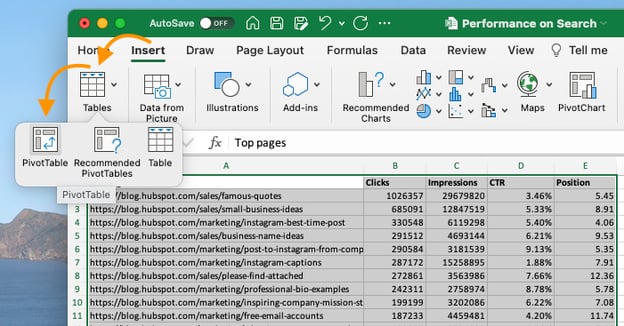
To pivot data in Excel, first select the data you wish to analyze. Next, click the Insert tab and select PivotTable. This will open the Create PivotTable window. Select the data range and the destination cell, then click OK. Finally, drag and drop the fields to the Rows and Columns section of the PivotTable Fields window.
- Select the data you wish to analyze
- Click the Insert tab and select PivotTable
- Select the data range and the destination cell in the Create PivotTable window
- Click OK
- Drag and drop the fields to the Rows and Columns section of the PivotTable Fields window
Understanding How to Pivot Data in Excel
Pivoting data in Excel is a powerful tool that can be used to analyze, organize, and present data in a meaningful and helpful way. With the help of pivot tables, it is easy to rearrange data to create meaningful insights and relationships between different data sets. Pivoting data in Excel can help to identify trends, compare values, and even reveal relationships that were previously not visible. This article will explain in detail how to pivot data in Excel and the different methods available to do so.
Creating Pivot Tables
The most common way to pivot data in Excel is by creating a pivot table. A pivot table is a summary of data in the form of rows and columns that can be manipulated to analyze data quickly and easily. To create a pivot table, select the entire data set and click “Insert” and then “Pivot Table.” This will open a window where you can select the fields you would like to include in the pivot table. You can also choose to add filters and slicers to the table to further customize the pivot table.
Once the pivot table is created, you can drag and drop fields to create different views of the data. For example, you can drag and drop the date field to the row area to display the data by month or by year. You can also drag and drop fields to the column area to compare values across different categories.
Using Pivot Charts
Another way to pivot data in Excel is by creating a pivot chart. A pivot chart is a graphical representation of the data in the form of bars, lines, or other shapes. To create a pivot chart, select the entire data set and click “Insert” and then “Pivot Chart.” This will open a window where you can select the fields you would like to include in the chart.
Once the chart is created, you can drag and drop fields to create different views of the data. For example, you can drag and drop the date field to the axis area to display the data by month or by year. You can also drag and drop fields to the legend area to compare values across different categories.
Using Pivot Tables and Pivot Charts Together
You can also use pivot tables and pivot charts together to create a comprehensive analysis of your data. To do this, create a pivot table and select the fields you would like to include in the table. Then, click “Insert” and then “Pivot Chart.” This will open a window where you can select the fields you would like to include in the chart.
Once the chart is created, you can drag and drop fields to create different views of the data. For example, you can drag and drop the date field to the axis area to display the data by month or by year. You can also drag and drop fields to the legend area to compare values across different categories. The pivot table and pivot chart can then be used together to create a comprehensive and easy-to-understand analysis of the data.
Using Data Analysis Tools
Excel also includes a variety of data analysis tools that can be used to pivot data. These tools include the “Pivot Table Wizard,” the “Data Analysis Toolpak,” and the “Data Form.” To use these tools, select the entire data set and click “Data” and then “Data Analysis.” This will open a window where you can select the tool you would like to use.
The “Pivot Table Wizard” is a powerful tool that can be used to quickly and easily create pivot tables. The “Data Analysis Toolpak” is a tool that can be used to create graphs and charts from the data. The “Data Form” is a tool that can be used to quickly enter data into a table. All of these tools can be used to quickly and easily pivot data in Excel.
Using Formulas to Pivot Data
Another way to pivot data in Excel is by using formulas. Excel formulas can be used to quickly and easily manipulate data in a variety of ways. For example, the “INDEX” formula can be used to return the value of a cell in a specified row and column. The “VLOOKUP” formula can be used to find the value of a cell in a table based on a lookup value. The “SUMIF” formula can be used to sum values based on specified criteria.
Using formulas to pivot data in Excel can be a powerful and time-saving tool. However, it is important to have a good understanding of Excel formulas before attempting to use them to pivot data.
Conclusion
Pivoting data in Excel is a powerful tool that can be used to quickly and easily analyze, organize, and present data in a meaningful and helpful way. By understanding how to pivot data in Excel, it is possible to create meaningful insights and relationships between different data sets. This article has outlined the different methods available to pivot data in Excel, including creating pivot tables, using pivot charts, using data analysis tools, and using formulas.
Frequently Asked Questions
What is Pivot Data in Excel?
Pivot data in Excel is a tool used for data analysis and reporting. It enables users to transform and summarize large amounts of data into meaningful insights by rearranging and summarizing the data in a tabular format. Pivot data in Excel gives users the ability to quickly and easily explore data from different angles and identify trends, patterns, and correlations. This helps them to make better business decisions and generate useful reports to share with other stakeholders.
What are the Steps to Pivot Data in Excel?
To pivot data in Excel, the first step is to organize the data into an easy-to-understand format. This includes sorting the data by column, adding labels to the columns, and formatting the data. The next step is to select the data that needs to be pivoted. This can be done by selecting the entire dataset or by selecting specific cells.
Once the data has been selected, the user can click on the “Pivot Table” button in the “Insert” tab. This will open a dialog box that allows the user to select the data to be included in the pivot table. After selecting the data, the user can drag and drop the data fields into the “Rows”, “Columns”, and “Values” sections. The user can also add filters and sort the data to further customize the pivot table.
What are the Benefits of Pivoting Data in Excel?
Pivoting data in Excel has several benefits. It enables users to quickly and easily explore data from different angles and identify trends, patterns, and correlations. This helps them to make better business decisions and generate useful reports to share with other stakeholders. Additionally, using pivot tables can save time and reduce manual data entry. Pivot tables can also be used to create charts, graphs, and other visualizations to help present the data in an easier-to-understand format.
How to Create a Pivot Chart in Excel?
To create a pivot chart in Excel, the first step is to create a pivot table. Once the pivot table is created, the user can select the “Pivot Chart” button in the “Analyze” tab. This will open a dialog box that allows the user to select the chart type and the data to be included in the chart. After selecting the data, the user can drag and drop the data fields into the “Axes”, “Series”, and “Legend” sections. The user can also add filters and sort the data to further customize the chart.
How to Filter Pivot Data in Excel?
To filter pivot data in Excel, the user can select the “Filter” button in the “Analyze” tab. This will open a dialog box that allows the user to select the criteria for the filter. The user can then select the data to be included in the filter and the type of filter to be used. After selecting the data, the user can drag and drop the data fields into the “Rows” and “Columns” sections. The user can also add filters and sort the data to further customize the filter.
What are the Limitations of Pivoting Data in Excel?
One of the limitations of pivoting data in Excel is that it can be difficult to work with large datasets. Pivot tables can be slow and cumbersome when dealing with large amounts of data. Additionally, pivot tables are not designed to work with multiple data sources. Therefore, it can be difficult to combine data from different sources into a single pivot table. Finally, the data in a pivot table is limited to what is available in the original data set, so it can be difficult to create meaningful insights if the data is incomplete.
Pivot Table Excel Tutorial
Pivoting data in Excel is a powerful tool for uncovering insights from your data. With the right approach and practice, it’s easy to master. From creating simple pivot tables to filtering and sorting data, you now have the tools to transform your data into meaningful information. With Excel’s powerful pivot table feature, it is possible to answer complex questions with a few simple clicks, giving you the ability to make informed decisions. So go ahead and explore the potential of the pivot table!


