


How to Make a Pie Chart in Powerpoint?
Creating a pie chart in PowerPoint can be an effective way to visually represent data and show trends. Pie charts are often used to demonstrate how a whole is divided into various parts, and can be used to compare data. In this tutorial, you will learn how to make a pie chart in PowerPoint to get your information across in a visually appealing way.
How to Make a Pie Chart in Powerpoint?
- Open a new or existing PowerPoint presentation. Select the slide that you want to add the pie chart to.
- Go to the Insert tab and click on the Pie Chart icon. This will open a window with different pie chart options.
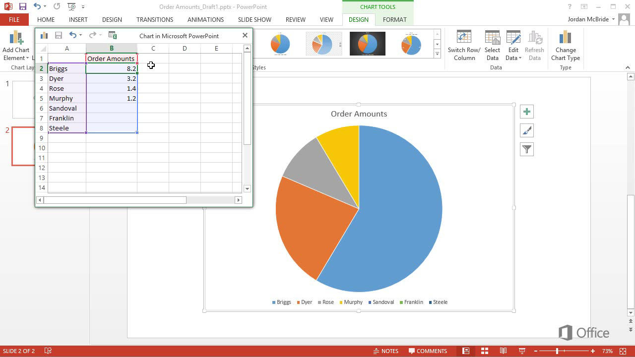
- Select your desired pie chart option and click OK. The pie chart will appear on your slide.
- Input the data that you want to display in your pie chart. You can do this by typing data into the spreadsheet window that appears.
- Click the design tab and select a design for your pie chart. You can also customize the colors and other elements of the pie chart.
- When you are done, go to the Slide Show tab and click on the Present button. Your pie chart will now be visible in the slide show.
Creating a Pie Chart in PowerPoint
A pie chart is a visual representation of data used to compare different categories of information. It can be used to illustrate the proportions of different parts of a whole. PowerPoint is an excellent tool for creating beautiful and professional-looking pie charts. This tutorial will guide you through the steps of creating a pie chart in PowerPoint.
Step 1: Collect Your Data
The first step in creating a pie chart in PowerPoint is to collect your data. The data should be organized into categories that you want to compare. You can use any source of data, such as surveys, research studies, or your own observations. Make sure that all of the data is accurately recorded so that your pie chart is accurate.
Step 2: Set Up Your Chart
Once you have gathered your data, it’s time to set up your chart. Open a new PowerPoint presentation and select the “Insert” tab. From there, select the “Chart” option and choose the “Pie” chart type. You will then be presented with an empty pie chart.
Step 3: Add Your Data to the Chart
The next step is to add your data to the chart. To do this, click on the chart and select the “Data” tab. In the “Data” tab, you will see a list of categories. You can then enter your data into each category. Make sure to double-check your data to ensure accuracy.
Step 4: Customize Your Chart
Once you have added your data to the chart, it’s time to customize it. You can do this by clicking on the chart and selecting the “Format” tab. In the “Format” tab, you can change the color, size, and style of your chart. You can also add labels and legends to your chart to make it more informative.
Step 5: Finalize Your Chart
The final step is to finalize your chart. To do this, simply save your chart and you’re done! Your pie chart is now ready to be used in your presentation.
Tips for Creating a Pie Chart in PowerPoint
Be Organized
When creating a pie chart, it’s important to remain organized. Make sure that your data is accurate and that you enter it into the correct categories. This will help ensure that your chart is accurate and informative.
Choose the Right Colors
The colors that you choose for your chart can have a big impact on its overall look. Choose colors that are appropriate for the type of data that you are presenting. For example, if you are presenting financial data, you may want to choose colors that represent money, such as green or gold.
Add Labels and Legends
Labels and legends can help to make your chart more informative. Make sure to include them in your chart so that your audience can easily understand the data that you are presenting.
Top 6 Frequently Asked Questions
Q1: How do I create a Pie Chart in Powerpoint?
A1: To create a pie chart in Powerpoint, open a new presentation, select the “Insert” tab, and then select the “Chart” icon. From the chart menu, select “Pie” as the chart type. You will then be able to enter your data into the chart. After entering your data, click the “Design” tab and select the “Change Chart Type” option. Select “Pie” to create your pie chart.
Q2: How do I customize my Pie Chart in Powerpoint?
A2: To customize your Pie Chart in Powerpoint, select the “Design” tab and select “Change Colors.” You can then choose from a variety of color schemes to customize your chart. You can also customize the size and shape of your chart by selecting the “Format” tab and selecting “Size and Position.” Additionally, you can add labels, titles, and legends to your chart by selecting the “Layout” tab and selecting the desired option.
Q3: How do I add data to my Pie Chart in Powerpoint?
A3: To add data to your Pie Chart in Powerpoint, select the “Insert” tab and then select the “Charts” icon. Select “Pie” as the chart type and then enter your data into the chart. You can also enter your data into a spreadsheet and then copy and paste it into the chart.
Q4: How do I format the data in my Pie Chart in Powerpoint?
A4: To format the data in your Pie Chart in Powerpoint, select the “Design” tab and then select “Change Colors”. You can then choose from a variety of color schemes to customize your chart. Additionally, you can format the data in your chart by selecting the “Format” tab and selecting “Data Labels.” You can then select the type of data labels you would like to include in your chart.
Q5: How do I add a legend to my Pie Chart in Powerpoint?
A5: To add a legend to your Pie Chart in Powerpoint, select the “Layout” tab and then select “Legend.” You can then choose to add a legend to your chart and customize it to your liking. You can also customize the position of the legend by selecting the “Format” tab and selecting “Size and Position.”
Q6: How do I save my Pie Chart in Powerpoint?
A6: To save your Pie Chart in Powerpoint, select the “File” tab and then select “Save As.” You can then choose where to save your file and what format you would like to save it in. You can also choose to save your chart as an image or PDF.
How to create a Pie chart in PowerPoint
Creating a pie chart in Powerpoint is a great way to quickly and effectively communicate data to any audience. Not only is it visually appealing, but it also helps to break down complex data into easy-to-understand segments. By following the steps outlined in this article, you can easily create a pie chart in Powerpoint and present your data in a professional and understandable way.


