


How To Create A Venn Diagram In Powerpoint?

Venn diagrams are an excellent way to visualize and compare data. They are often used in presentations and educational settings to quickly convey complex ideas. If you’re looking for an easy way to create a Venn diagram in Powerpoint, then you’ve come to the right place. In this article, we will walk you through the steps for creating a Venn diagram in Powerpoint. We’ll also provide tips and tricks to help you make the most of this powerful visual tool. So, if you’re ready to get started, let’s dive in!
- Open Powerpoint and select a blank slide.
- In the Insert tab, choose SmartArt.
- In the Hierarchy section, select the Venn diagram.
- In the Text pane, enter or paste the text or data you want to visualize.
- Adjust the shape and color of the diagram to your preference.
- Save your Venn diagram and you’re done!
How to Make a Venn Diagram in PowerPoint
Venn diagrams are a great way to visually represent data and information in a concise, organized manner. They are a great tool for presentations, reports, and other documents. Creating a Venn diagram in PowerPoint is a fairly simple process that can be done in just a few steps.
The first step is to open up PowerPoint and create a new slide. On this slide, you will need to add the shapes that will make up your Venn diagram. This can be done by selecting the Insert tab and then selecting Shapes. You can then select the shapes you want to use for your Venn diagram. You can also use the built-in Venn diagram template that is included in PowerPoint.
The next step is to arrange the shapes so that they form a Venn diagram. You can do this by using the Arrange tab in the ribbon. This tab will allow you to move, rotate, and resize your shapes. Once you are satisfied with the arrangement, you can add text to the shapes. This can be done by selecting the Text Box icon in the ribbon. You can then type in the text you want to appear in each of the shapes.
Adding Color to the Shapes
The next step is to add color to the shapes. This can be done by selecting the Shape Fill option in the ribbon. You can then select the color you want to use for each of the shapes. You can also use the built-in color wheel to choose a color. Once you are satisfied with the color selection, you can click apply to apply the color to the shapes.
Adding Connectors to the Shapes
The final step is to add connectors to the shapes. This can be done by selecting the Connector option in the ribbon. You can then select the shape of the connector you want to use. You can also adjust the size and position of the connector by using the Resize and Move options in the ribbon. Once you are satisfied with the connector settings, you can click apply to apply the connector to the shapes.
Formatting the Diagram
Now that you have created your Venn diagram, you can format it to make it look more professional. This can be done by selecting the Format tab in the ribbon. This tab will allow you to customize the size, font, color, and other aspects of the diagram. You can also adjust the spacing and alignment of the shapes to make them look more organized.
Adding Graphics to the Diagram
If you want to add some visual elements to your diagram, you can do so by selecting the Insert tab in the ribbon. This tab will allow you to add images, charts, and other graphics to your diagram. You can also use the built-in clip art to add some extra visual interest to your diagram.
Saving the Diagram
Once you are satisfied with the way your Venn diagram looks, you can save it. This can be done by selecting the File tab in the ribbon and then selecting Save As. You can then name your file and save it in the desired location.
Printing the Diagram
If you need to print your Venn diagram, you can do so by selecting the Print tab in the ribbon. This tab will allow you to select the printer and paper size you want to use. Once you have selected the desired settings, you can click Print to start the printing process.
Few Frequently Asked Questions
What is a Venn Diagram?
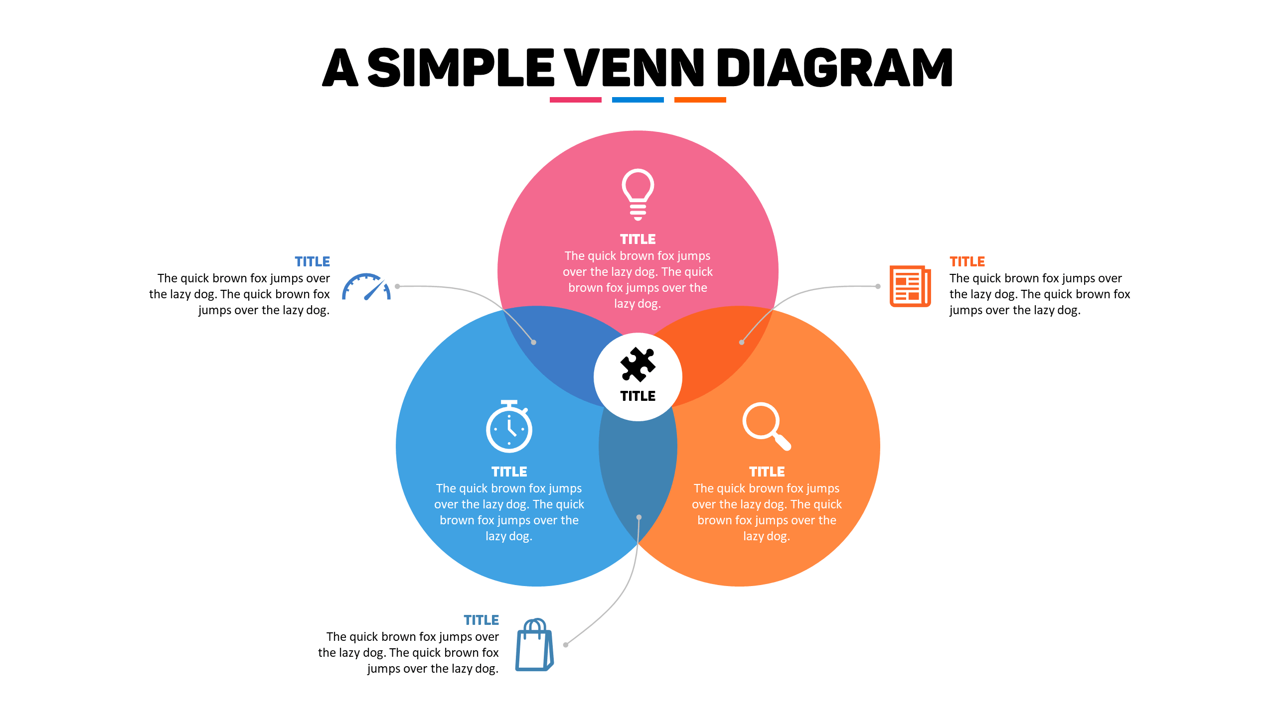
A Venn diagram is a graphical representation of the relationships between two or more sets of data. It is made up of circles which are usually overlaid on top of each other, with the intersection of the circles representing the shared characteristics of the two sets. For example, a Venn diagram could be used to compare the shared characteristics between two sports teams, or to show the differences between two types of animals.
How do I Create a Venn Diagram in Powerpoint?
Creating a Venn diagram in Powerpoint is a simple process. First, open the Powerpoint application and select the “Insert” tab. From there, choose the “Shapes” option and select the Venn diagram shape. Once the shape is added to the slide, it can be customized by clicking on it and adding text, images, and other graphics to the circles.
What Text Can I Add to a Venn Diagram?
You can add any text you want to a Venn diagram in Powerpoint. For example, you could add labels to the circles, such as “Team A” and “Team B” for a comparison of two sports teams. You can also add descriptive text to the intersection of the circles to explain the shared characteristics between the two sets.
How Can I Customize the Look of My Venn Diagram?
You can customize the look of your Venn diagram in Powerpoint by selecting the shape and then using the “Format” tab. From there, you can change the color, size, and shape of the circles, as well as add shadows and outlines. You can also customize the text, including font type, size, color, and alignment.
Are There Any Other Features of a Venn Diagram in Powerpoint?
Yes, you can add animation to your Venn diagram in Powerpoint. To do so, select the shape and then click on the “Animations” tab. From there, you can choose from a variety of animation options, such as appearing one circle at a time or having the circles rotate around each other.
Can I Add a Venn Diagram to an Existing Slide?
Yes, you can add a Venn diagram to an existing slide in Powerpoint. To do so, select the slide and then click on the “Insert” tab. From there, choose the “Shapes” option and select the Venn diagram shape. You can then customize the diagram, such as adding text or images, and animate it if desired.
How to create a Simple Venn Diagram in PowerPoint
Creating a Venn diagram in Powerpoint is a great way to visualize data and clearly demonstrate how different sets of information intersect. With the right tools, you can create a visually pleasing Venn diagram that helps you easily explain complex concepts or data sets. With the clear instructions outlined in this guide, you now have the resources to create a visually appealing and effective Venn diagram in Powerpoint. Whether you are a student, teacher, or professional, this guide will help you effectively create and use Venn diagrams in Powerpoint to illustrate data and concepts.


