


How to Make a Stacked Column Chart in Excel?

Creating charts in Excel is a great way to visualize data and make it easier to analyze. Stacked column charts are one of the most versatile and useful types of charts you can create. They are perfect for comparing different categories of data over a period of time. In this article, we will show you how to make a stacked column chart in Excel. You will learn how to customize the chart to make it even more effective and informative. Let’s get started!
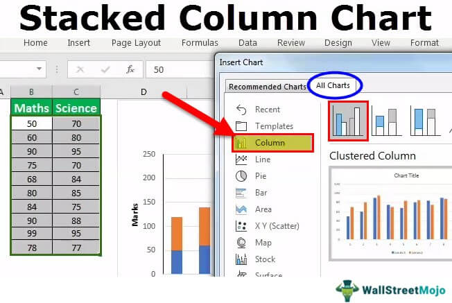
- Open an Excel spreadsheet with the data that you want to use.
- Highlight the data.
- Click “Insert” and select “Stacked Column Chart.”
- Choose the type of chart you want to create.
- Analyze the data in the chart.
Create a Stacked Column Chart in Excel
Stacked column charts are a great way to compare data sets and visually understand how different pieces of data contribute to the whole. Excel makes it easy to create a stacked column chart, allowing you to quickly and easily compare different data sets. In this guide, we’ll walk you through the steps of creating a stacked column chart in Excel.
Step 1: Enter Data Into Excel
The first step in creating a stacked column chart in Excel is to enter your data into the spreadsheet. Make sure your data is organized in columns and rows, and that each column is labeled with a descriptive title. Once your data is entered, highlight the data you want to include in the chart.
Step 2: Create the Chart
Once your data is entered and highlighted, you can create the chart. To do this, go to the “Insert” tab at the top of the spreadsheet and click “Column.” A drop-down menu will appear, from which you should select “Stacked Column.” Once you do this, your chart will appear.
Step 3: Customize the Chart
Once your chart has been created, you can customize it to better fit your needs. To do this, click on the chart and a new menu will appear. From here, you can change the title of the chart, the axes, the data series, and more. You can also add labels to the chart and change the colors of the columns.
Step 4: Format the Chart
Once your chart is customized, you can begin formatting it. To do this, click on the chart and a new menu will appear. From here, you can change the font size, font color, background color, border color, and more. You can also add gridlines, change the chart type, and add data labels.
Step 5: Save and Share the Chart
Once your chart is formatted, you can save and share it. To do this, click on the “File” tab at the top of the spreadsheet and select “Save As.” From here, you can save the chart as an image file or an Excel file. You can also share the chart by clicking on the “Share” tab and selecting “Share with People.”
Tips for Creating a Stacked Column Chart in Excel
Tip 1: Use Descriptive Titles
When entering your data into Excel, make sure each column is labeled with a descriptive title. This will make it easier to create and customize the chart.
Tip 2: Keep the Chart Simple
When creating your chart, try to keep it as simple as possible. Too many elements can make it difficult to read and understand.
Tip 3: Use Colors to Highlight Important Information
When customizing the chart, use different colors to highlight important information. This will make it easier to read and understand the data.
Frequently Asked Questions
What is a Stacked Column Chart?
A stacked column chart is a type of chart used to visualize data and show comparisons among related categories. It displays series of data as a set of vertical columns, each of which is divided into multiple segments to represent different values. The segments are color-coded, allowing for easy differentiation between the categories and data points. The chart can also be used to display cumulative values over time, making it a useful tool for tracking performance, trends, and other data analysis.
What are the Benefits of a Stacked Column Chart?
The stacked column chart is a great tool for providing a visual representation of data. It helps to quickly compare values, spot trends, and identify outliers. Additionally, it allows users to compare different categories of data, as well as compare cumulative data over a period of time. It is also easy to read and interpret, and all of these benefits make it a popular choice for data analysis.
How do I Create a Stacked Column Chart in Excel?
Creating a stacked column chart in Excel is relatively straightforward. First, select the data to be charted, then click the “Insert” tab in the ribbon at the top of the page. Then click the “Stacked Column” chart option. The chart will then appear in the spreadsheet. Finally, the chart can be customized by selecting the “Design” tab and changing the colors, labels, and other elements as desired.
Are There Any Limitations of Using a Stacked Column Chart?
The stacked column chart can be an effective tool for visualizing data, but it does have some limitations. First, the chart is more effective for smaller data sets and may become difficult to read when displaying large amounts of data. Additionally, it can be difficult to compare individual values when the segments are stacked.
What Other Types of Charts can be Used to Visualize Data?
There are many other types of charts that can be used to visualize data, including line charts, bar charts, scatter plots, pie charts, and area charts. Each type of chart has its own strengths and weaknesses, and the best choice will depend on the type of data being displayed.
What Data Types are Suitable for a Stacked Column Chart?
A stacked column chart is best suited for visualizing data sets with multiple categories. It is a useful tool for comparing cumulative data over time, as well as for comparing different categories. Additionally, it is a good choice for displaying data that includes outliers or discrepancies.
How to create a Clustered Stacked Column Chart in Excel
Excel’s Stacked Column Chart feature is a powerful tool that can be used to quickly and easily create visually appealing charts. It is user-friendly, versatile and customizable and can be used to create charts that are easy to understand and give a clear representation of data. With a few simple steps, anyone can create a Stacked Column Chart in Excel that is sure to impress.


