


How to Show Increase or Decrease in Excel?
Excel is one of the most powerful and versatile tools in the business world today. Whether you are an accountant, data analyst, or even a casual spreadsheet enthusiast, this program can help you accomplish a variety of tasks. If you’re looking to quickly and easily show an increase or decrease in a set of data, Excel is the go-to program. In this article, we’ll explore how to show an increase or decrease in Excel and provide some helpful tips and tricks for getting the most out of the program.
To show increase or decrease in Excel, you can use a simple line chart. This will compare two or more sets of data and show the differences between them. First, select the data you want to compare. Then, click the Insert tab and select the Line Chart icon. Finally, customize the chart to your liking and you’re done!
- Select the data you want to compare
- Click the Insert tab and select the Line Chart icon
- Customize the chart to your liking
How to Show Increase or Decrease in Microsoft Excel
Microsoft Excel is a powerful data analysis tool used to display and track changes in data over time. It can easily be used to show an increase or decrease in data over a certain period. Whether you want to compare two or more data points or just track one data point over time, Excel can help you do this quickly and easily.
The first step in displaying increase or decrease in Excel is to input your data into the spreadsheet. This can be done by entering the data into individual cells, or by creating a table with the data already included. Once your data has been entered, you can then use the different charting and graphing tools available in Excel to display the data in a meaningful way.
There are several types of charts and graphs that can be used to show increase or decrease in Excel. These include bar graphs, line graphs, column graphs, pie charts, and scatter plots. Each of these types of charts offers a different way to compare or display the data. Depending on the type of data you are working with, you may want to choose the chart that best suits your needs.
Using Line Graphs to Show Increase or Decrease
Line graphs are a great way to show changes over time. They are particularly useful for showing increases and decreases in data points over a period of time. To create a line graph in Excel, simply select the data points you want to include in the graph and click on the ‘Insert’ tab and then select the ‘Line’ option. This will open up a dialog box that will allow you to select the type of line graph you want to create.
Once you have chosen the type of line graph, you can then customize it by changing the colors, fonts, and labels. You can also add annotations to the graph to show any significant changes or trends. This will help make your graph more meaningful and easier to understand.
Using Bar Graphs to Show Increase or Decrease
Bar graphs are another type of chart that can be used to show increases or decreases in data points over time. To create a bar graph in Excel, simply select the data points you want to include in the graph and click on the ‘Insert’ tab and then select the ‘Bar’ option. This will open up a dialog box that will allow you to select the type of bar graph you want to create.
Once you have chosen the type of bar graph, you can then customize it by changing the colors, fonts, and labels. You can also add annotations to the graph to show any significant changes or trends. This will help make your graph more meaningful and easier to understand.
Using Pie Charts to Show Increase or Decrease
Pie charts are a great way to show changes in data points over a period of time. To create a pie chart in Excel, simply select the data points you want to include in the graph and click on the ‘Insert’ tab and then select the ‘Pie’ option. This will open up a dialog box that will allow you to select the type of pie chart you want to create.
Once you have chosen the type of pie chart, you can then customize it by changing the colors, fonts, and labels. You can also add annotations to the graph to show any significant changes or trends. This will help make your graph more meaningful and easier to understand.
Using Column Graphs to Show Increase or Decrease
Column graphs are another type of chart that can be used to show increases or decreases in data points over time. To create a column graph in Excel, simply select the data points you want to include in the graph and click on the ‘Insert’ tab and then select the ‘Column’ option. This will open up a dialog box that will allow you to select the type of column graph you want to create.
Once you have chosen the type of column graph, you can then customize it by changing the colors, fonts, and labels. You can also add annotations to the graph to show any significant changes or trends. This will help make your graph more meaningful and easier to understand.
Using Scatter Plots to Show Increase or Decrease
Scatter plots are a great way to show changes in data points over a period of time. To create a scatter plot in Excel, simply select the data points you want to include in the graph and click on the ‘Insert’ tab and then select the ‘Scatter’ option. This will open up a dialog box that will allow you to select the type of scatter plot you want to create.
Once you have chosen the type of scatter plot, you can then customize it by changing the colors, fonts, and labels. You can also add annotations to the graph to show any significant changes or trends. This will help make your graph more meaningful and easier to understand.
Related Faq
What is “Conditional Formatting” in Excel?
Conditional Formatting in Excel is a feature that allows users to apply specific formatting to cells based on their content. It allows users to highlight or differentiate data by changing the font, fill color, border, etc. of the cell based on the data that is inputted. For example, users can easily display values above or below a certain threshold with a different fill color.
How to Show Increase or Decrease in Excel?
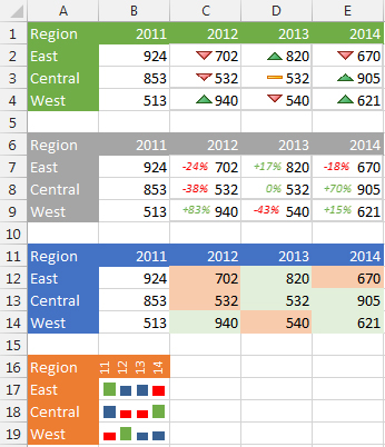
To show increase or decrease in Excel, you can use the Conditional Formatting feature. First, select the cells you want to format. Then, click on the Conditional Formatting drop down and choose “Data Bars”, “Color Scales”, or “Icon Sets”. Depending on the selection, you can choose the type of data bars, color scales, or icon sets you want to display. For example, if you select “Data Bars”, you can choose from a variety of different types of data bars such as “Gradient Fill”, “Short Data Bars”, and “Long Data Bars”. If you select “Color Scales”, you can choose from a variety of different color scales such as “Green-Yellow-Red”, “White-Red”, and “White-Blue”. And if you select “Icon Sets”, you can choose from a variety of different icon sets such as “3 Arrows” and “3 Symbols”. Once you select the conditional formatting, Excel will display the increase or decrease in the values by applying the selected formatting.
How to Remove Conditional Formatting from Excel?
To remove conditional formatting from Excel, first select the cells that you want to remove the formatting from. Then, click the Conditional Formatting drop down menu and choose “Clear Rules”. You can then choose to clear rules from the selected cells, or clear all rules from the entire sheet. Once the formatting is removed, the original formatting and values will be displayed in the cells.
What are the Benefits of Using Conditional Formatting in Excel?
The main benefit of using Conditional Formatting in Excel is that it makes it easier to quickly identify trends and patterns in data. By applying different formatting to cells based on their content, users can easily differentiate between different data points. This can help users better analyze and understand data, which can be especially useful when dealing with large datasets. Furthermore, Conditional Formatting can be used to highlight important data points and make them stand out, which can help to draw attention to important trends or patterns.
How to Add Data Bars in Excel?
To add data bars in Excel, first select the cells that you want to add data bars to. Then, click on the Conditional Formatting drop down and choose “Data Bars”. You can then choose from a variety of different types of data bars such as “Gradient Fill”, “Short Data Bars”, and “Long Data Bars”. Once you select the data bar type, Excel will apply the data bars to the selected cells and display the increase or decrease in the values.
What is the Difference Between Data Bars and Color Scales in Excel?
The main difference between data bars and color scales in Excel is the way that they display the increase or decrease in values. Data bars are vertical bars that are applied to the cell and can be used to display a wide range of values. Color scales are applied to the cell as a gradient of colors and can be used to display values between two points. For example, a color scale can be used to display values between 0 and 100%, with the color changing from green to red based on the value.
How to Use Increase Decrease Arrows in Excel
By following the steps outlined in this article, you should now have the knowledge and skills to show increases and decreases in Excel. From creating graphs, to using formulas to calculate the difference in values, to using the built-in features of Excel to automatically highlight the changes, you now have the tools to easily visualize and understand the changes in your data. Knowing how to show increases and decreases in Excel is a valuable skill that will help you to make better decisions in your work and everyday life.


